Definition List

ONE LOVELY DRAWING, part two

###

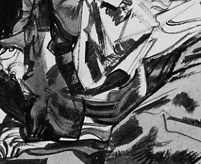
This jewel of a drawing by the great Robert Fawcett was a spot illustration for the story Mutiny in Paradise which appeared in This Week magazine in May 1957.

The original magazine was printed on cheap pulp paper, and most copies have long since crumbled into silt. I am posting a scan of the original so that this fine, arrogant drawing will continue to get the audience it deserves. Contrast Fawcett's use of drybush to convey the depth of the jungle outside the hut with the slashing brush strokes of the wall which energize the whole drawing.


Fawcett understood anatomy so well that he was able to depict the feet of the character with speed and confidence, despite their odd angle.


Most important, note how the subject matter was subordinated to the abstract design of the picture. Fawcett always said that the longer an artist could work on a representational drawing at the purely abstract level, the better.

###

ONE LOVELY DRAWING

###


While it is great fun to talk about the larger landscape of art, sometimes you can see more by looking through a microscope than by looking out the window of an airplane.

That's especially true when you are talking about the intimate art of drawing. As I have noted elsewhere, I think art critic Roberta Smith got it exactly right when she wrote about the special quality of drawing:


Drawings are the most overtly delectable of all art forms...Drawings in general are like love letters. Personal in touch and feelng, physically delicate, they reflect the artist's gifts, goals and influences in the most intimate terms... [They are] a direct extension of an artists's signature and very nervous system.
So I think it makes sense to take time out from bloviating about the art world to reflect on an individual drawing. I will be doing this on a regular basis, to bring attention to selected examples of long forgotten treasure and to give my detractors a better understanding of what I mean when I write about the great potential of drawing.


The illustrator Austin Briggs was featured this week in Leif Peng's excellent Today's Inspiration blog (http://todaysinspiration.blogspot.com/) which I heartily recommend to you. I am posting here a drawing by Briggs which has hung outside my bedroom door for ten years. This drawing of a World War II monument in Paris was executed with a dull crayon, yet it conveys astonishing subtlety and sensitivity. The virtuoso Briggs could've threaded a needle while wearing boxing gloves.


Notice in the detail above how Briggs has captured the man's stooped posture, his raised shoulder encircling his companion, his neck projecting from his collar, the bald crown of his head, and how efectively the simple indication of an ear conveys the man's reverse profile. With a crude tool and a primitive line, Briggs conveys more wisdom and insight about his subject than a thousand other artists might have conveyed using modern, precise tools and the most labored approach. Now that's drawing!


The statue, too, is rendered in a marvelous, vigorous way. Using nothing but talent and the simplest of tools-- a single black stick of wax-- Briggs created a symphonic range of effects to convey great power: shading, smearing, applying different pressure for different values, all applied with a confidence that reinforces the power of his subject. I hung this simple drawing outside my door ten years ago and I still learn something new from it almost every day.
###

THE BATTLE BETWEEN GOOD TASTE AND GOOD ART

###

When the illustrator Robert Fawcett decided to abandon fine art for illustration, His painter friends objected that illustration was coarse, vulgar and tasteless. Fawcett responded that "good taste" is often the enemy of creativity:

the creative act in art involves a kind of courage which good taste might easily modify. It almost seems as if the creative impulse involves a large ingredient of vulgarity to be a vital statement. In drawing, an excess of what we think of as good taste can only result in an anemic product, while the more vulgar statement... is invariably stimulating.

Pulitzer prize winner Michael Chabon sided with Fawcett, praising comic art as straddling
"high art and low art [at] the margins of trash and quality....There's something stimulating about hanging out at the borders there."

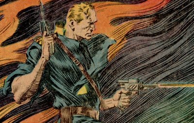
One of the most marvelous inventions to spring from the borders of trash and quality was Alex Raymond's comic strip, Flash Gordon. These virile drawings with their gorgeous lurid coloring are from a Sunday page in 1935.
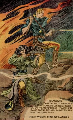
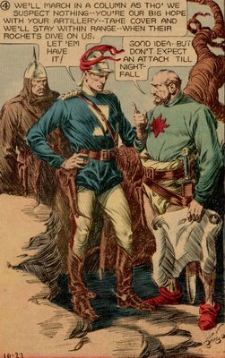
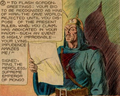


Unfortunately, vulgarity has few defenders left these days. The priests of high art have learned to tolerate many forms of marginal art but have never quite overcome their aversion to rocket ships and ray guns. Even illustrators who should know better often pull up the ladder behind them once they achieve some legitimacy. When Edward Sorel, a caricaturist of modest skill, had a show at the National Portrait Gallery he quickly changed uniforms. I asked his opinion of his fellow caricaturists at MAD magazine and he sniffed with derision, "those people are vulgar."

Once upon a time, vulgar (meaning uncouth and unrefined) art was not such a problem. The greatest works of western culture were filled with slapstick humor, violence and sex. Homer, Chaucer and Shakespeare are riddled with vulgarity. Chaucer, for example, loved flatulence jokes more than Howard Stern does. Here he writes about how a woman, after cheating on her husband with one lover, sticks her naked bottom out a window to trick a second suitor who is standing outside begging for a kiss in the night:

Dark was the night as pitch, aye dark as coal
And through the window she put out her hole...
With his mouth he kissed her naked arse
Right greedily, before he knew of this.
Aback he leapt-- it seemed somehow amiss,
For well he knew a woman has no beard...
And said, "Oh fie, alas! What did I do?"

Compared to Chaucer, Flash Gordon seems positively refined. I don't recall Dale Arden resorting to anything so uncouth. Yet, pale critics weighed down by too much history and too much taste look at the excess in Flash Gordon and recoil.
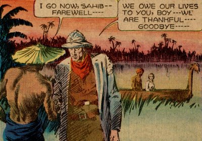
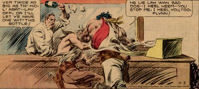


Vulgar art flourishes even without defenders for the best of all possible reasons: because its strength commands an audience. It is robust art in a great cultural tradition. Some of the best ideas come from just outside the borders of good taste, wearing a little too much rouge, and we should not be so quick to take offense .


###

WOWEE, LOOK AT THOSE HANDS!

###


Nobody draws hands like the great Mort Drucker.

close up, with pencil lines

If you study Drucker's stories for MAD magazine, you will see a wonderful ballet of hands from one panel to the next. Note in the following drawing how, in a tiny space crammed with Marlon Brando, Robert Duvall, Al Pacino and other superstars, a hand still dominates center stage.


There are at least two important lessons to draw from Drucker's treatment of hands.

First, Drucker constructs hands like a master architect-- he understands the structural foundation of his subject, and that gives his drawings solidity. But that's only the start. For some artists, extensive knowledge of anatomy can have a deadening effect. It locks them into a certain mechanical way of thinking. It becomes an anchor that weighs down creativity.


But if you're really good-- like Drucker-- your knowledge of anatomy sets you free. Drucker could never achieve his springing, bouncing joyful line if he had to slow down to consult reference every time he drew a hand. He has internalized his knowledge, and it has given him a solid foundation from which he can launch his trademark "slapdash" line with confidence. There's no other way to achieve that effect.


The second lesson is that Drucker did not need to draw all those hands in order to get paid for the job. The picture below would have been quite complete without one hand knocking on the door, a second hand grasping the door knob and a third gesturing in mid air.


Look in the following close up at the work that went into drawing three hands that could just as easily have been cropped from the bottom of the panel. These were not drawn for the sake of the editor.

That, my friends, is the real definition of art for art's sake.

###
 

Privacy Policy

Popular Posts

Blog Archive