Definition List

A GIFT FOR DELUSION

###
Once upon a time, an artist was born in a shabby apartment in a bleak part of NY City. He grew up playing in vacant lots littered with junk. He watched neighbors beating their wives in the street. Once a drunk died in front of him on the sidewalk. The boy learned at a young age to call Jews "kikes" and Italians "wops." Sometimes he watched from the roof of his apartment as street gangs battled below. For amusement, he would spit on pedestrians walking by. Quitting school (he was always a poor student) he leased a spare room in a whore house.

That artist was Norman Rockwell.


Was Rockwell's sweet vision of small town America nothing but a cynical charade?

I don't think so.

We each perceive the world through our own personal filter. Sometimes artists employ a more active filter than others; perhaps it's a natural defense to their chronic poverty and lack of success with the opposite sex. Below, some artists have fun with the disparity between reality and their artistic vision:


Leyendecker


Picasso


Saul Steinberg

Personally, I don't think think Rockwell was trying to con his audience. His art had less to do with the illusion of reality than the reality of illusion.

###

PAUL COKER, JR.

###


You've seen Paul Coker Jr.'s drawings all over the place-- on countless greeting cards, ads, magazines and comic books-- but when was the last time you actually paused to look at them? His drawings may appear simple, but they reflect considerable sophistication and talent.

For example, Coker understands anatomy and body language. Notice the shoulders and lowered head of this boy looking over his father's work:


or the twist of the body and the bouncing step of the happy runner in the background:


This is how a good artist uses anatomy: not as a distraction, but with confidence and understatement, in the service of the total image. Coker's drawings never brag about his knowledge, but they would not "ring true" without it.

Or look how at how Coker takes fundamentally symmetrical subjects-- a ball, or a standing boy-- and transforms them into highly asymmetrical, interesting shapes by means of the personality in his drawing:


And Coker's mastery of facial expressions ranges from the reserved (above) to the zany (below).


Any artist who has been asked to draw children knows how incredibly difficult it is to simplify them without losing character and believability. In my view, only a handful of cartoonists, such as Charles Schulz, Percy Crosby, Hank Ketcham and Paul Coker managed to pull it off well.


Coker's drawings will never attract the kind of fanatical fans who collect pictures of muscular barbarians or huge-breasted space nymphs.  Coker specializes in a different kind of subject matter.


Nevertheless, he is a highly observant and subtle artist who draws with a beautiful line. I wanted to post a few examples here for those of you who may have thought that the pictures on Hallmark cards weren't worth your attention.


###

EARTH, AIR, FIRE and WATER (and of course, ART)

###
In the flickering light from ancient torches, the shadows on cave walls suggested mastodons and bulls to our prehistoric ancestors. They became the world's first artists, reaching out with charcoal to complete visions that were inspired by the earth's shapes:


This cave wall suggested the head of a deer to some prehistoric artist


This large rock reminded an artist of a horse

In this way, the earth and the artist came together to create art.

30,000 years later, artists discovered stained glass. Rather than drawing with sticks in the dirt or making marks on parchment, artists were now able to combine their art with the radiance of light. Look what glorious things happened when artists added sunshine to their palette of colors:


Nativity scene from Priory Church, circa 1501


Prayer of a righteous man, St. Mary's Church, late 14th century


The Last Judgment, 15th century

Just like with the earth, the artists combined with the sun to create art.

At some unknown point in the distant past, artists discovered that by making designs and colors on cloth rather than on hard surfaces, their designs could take on the shape of the wind. Static images became flying banners that inspired armies and flags that symbolized nations.


Christo's "Gates" in NY, copyright 2005 Christo and Jeanne-Claude

Once again, the artist teamed with the elements to make art, combining wind and image.

Artists who use watercolor, if they are wise, take advantage of water's special properties rather than concealing its role. Even artists who specialize in tightly controlled images seem to gain depth and profundity when they give the freedom of water a larger role in the artistic process.


Saul Steinberg began his career with technical pen drawings with geometric shapes and cross hatching, but later turned water loose to create lovely skyscapes.


Here, Andrew Wyeth wisely did not attempt to paint snowflakes. He randomly spattered liquid tempera, using the qualities of water to contribute the effect of snow.

Just like with earth, sun and wind, the artist can interact with water to create a higher form of art.

All of these beautiful images we have seen were made more beautiful because the artist opened the artwork to the elements. Nature adds variety, change, unpredictability, ambiguity, mistakes and uncertainty to the product of human will. Water does whatever it wants, and watchful artists keep their eyes open for the happy accident. The light through stained glass windows changes depending on the time of day or month of the year or the weather outside, creating very different effects. When the wind shifts, flags do a completely different dance.

One concern I have with digital art is that it seems to reduce the important role played by the elements in the creation of art. We can now assert greater and greater control over the screen, pixel by pixel. The light from a cathode ray tube or a plasma screen remains constant, regardless of the time of day or year. The mathematical formulae used for CGI are immutable. Color can be adjusted for saturation, brightness and contrast in tiny increments. Mistakes and accidents can be effortlessly eradicated with mid-course corrections. And the pictures never, ever change with the wind.

###

ROBERT FAWCETT'S OPINIONATED DRAWING

###
When it comes to strong, opinionated drawings, I know of no 20th century illustrator better than Robert Fawcett.

He did not simply record the world around him, he aggressively sought out nature's designs and amplified them with astonishing power and clarity. For example, this vigorous drawing...


...is just the seat of some old guy's pants in one of Fawcett's illustrations.


How many other artists could find such energy and beauty in such a banal subject? Next, look at the designs Fawcett finds in the folds of Sherlock Holmes' cape...


...or in the anatomy of a hand. Now that's what I call drawing!


More bold designs in the pants legs and clothing of this couple stranded in the desert:


Even the most delicate lines reflected Fawcett's distinctive personality. Note the hair of this lovely young lady from a P.G. Wodehouse story.


Some very astute observers of illustration art, such as Mike Vosburg and Leif Peng, recently paid fresh attention to Fawcett's work on their web sites. He has been gone for 40 years, but Fawcett's art always rewards attention.
###

LEAVING THE BEST UNTOLD

###
I swear I see what is better than to tell the best,
It is always to leave the best untold.
.......................................... . --Walt Whitman
Illustrator Robert Hilbert decided that the best way to convey a man who had hung himself was not to paint the noose around the man's neck, but to imply the event in a way that draws the viewer into the picture:


By exercising restraint, an artist compels the viewer to engage in the picture. When the viewer has to meet the artist halfway, it personalizes art and makes the experience more meaningful.

Sometimes artists receive unwanted help in deciding what parts of a picture to leave to the imagination. Congress famously required publisher Bill Gaines to explain how the following picture was "tasteful" merely because it refrained from showing where the woman's head had been severed:


Of course, today Gaines would have no trouble showing the severed neck and a whole lot more. Not only is there little risk in being daring, there's hardly any sport left in it either. I applaud artists who fight censorship, but many seem to have trouble distinguishing censorship from artistic restraint. Here's a hint: the former is your enemy, but the latter is your best friend.

For example, Walt Whitman paid a heavy price for the freedom to put anything he wanted in his explicit poems. But he recognized that a license to say anything doesn't mean he should say everything. There are separate aesthetic reasons to "leave the best untold."


This awful drawing from New York's Museum of Modern Art makes you yearn for the days of the Counter-reformation, when gloomy Vatican censors pasted fig leaves on art that dared to show human genitals:


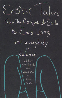
But here is a selection of less explicit, more inspired images that succeed by "leaving the best untold."


The brilliant Milton Glaser conjures up a mood with a limited palette and a glimpse of thigh


A few simple lines on a plain background are enough to create an extraordinary effect on the viewer's imagination


Look at how evocative mere feet can be


If Tomer Hanuka's cover was more detailed or explicit, it would only lose some of its considerable heat

Our current freedoms might help us to achieve great artistic heights, but they are just as likely to lure artists into spelling out things in explicit detail that would have been artistically stronger if left untold.


###
 

Privacy Policy

Popular Posts

Blog Archive