skip to main
|
skip to sidebar
###
Here's how it goes:
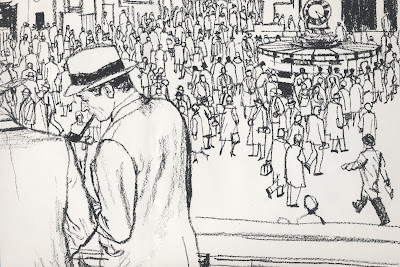
There are details that hum and details that sing. There are details that accumulate like silt when the artist isn't paying enough attention, and smother the picture.
Then there are details where artists with impeccable technique find refuge from larger questions of meaning and purpose.
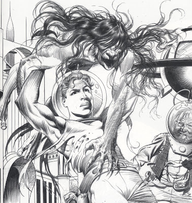
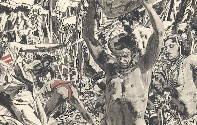
 Wrightson
There are details that are diamantiferous...

Briggs
all the way down to the subatomic level....


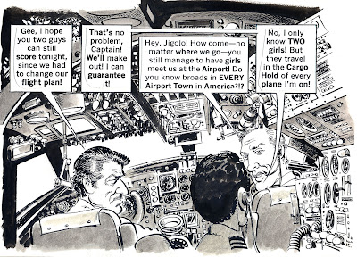
Then there are details so insanely disproportionate that we can only attribute them to the addiction to drawing (an addiction that has so far bested every methadone program offered by art schools).

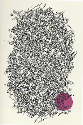
Drucker
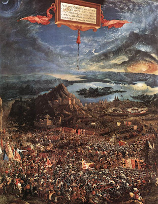
Of course, we forgive the fanatical details in some Renaissance art; they were created in an era of fresh excitement for empirical facts and the physical world, after artists awakened from a long medieval fixation on the afterlife. Renaissance artists were entitled to their obsessive focus on the natural world, but you'd better have an equally good excuse if you want to get away with the same level of detail today.

Altdorfer
There are details which are just a playground for scamps.

Wood
Then there are sly details, the ones that seduce the artist with his own skill. Be on your guard, for these are the most dangerous details of all!

Frazetta
There are details that envelop you in a warm bath, and there are details that shimmer like phosphorescence in the sea at night and swirl around you, drawing you deeper into the picture to the place where mermaids whisper that answers do exist.
On those rare occasions when an artist exercises restraint, the few carefully selected details can acquire supernatural power. The single line of a stocking can inspire you to leave a bookstore and go hunting for your wife.

Sometimes detail gets lucky and is given a starring role in a picture, as when an artist merges the background with the foreground, making the center of the picture everywhere at once.

Fawcett
Once upon a time, laborious detail was the cheapest and safest way to make a picture important to a viewer. Even if the art was no good, viewers were flattered that the artist was willing to trade so many hours of his life to entertain them. But the muse became indignant that her supplicants were abandoning her for the god of manual labor, so she invented photoshop. Now even the lure of cheap flattery is gone.

Nicolausson
Scientists report that fully 17% of the artistic details in the known universe are attributable to cowardice; there are artists who add detail to hedge their bets, believing that it is safer to draw lots of little lines than one big one. But artists who believe they can escape accountability by blurring their choices with three or four lines where one would suffice are wrong. The fatal flaw with their theory is what the economists call diminishing marginal utility: with each additional superfluous line the artist invests a little less thought or judgment (and adds less value to the picture).
So many lines-- hundreds of millions of them throughout history-- are conceived in hope, only to end up as part of an endurance test for crow quill pens. One can only ponder the wasted potential, the disappointed ambitions of these lines whose lives were stripped of individuality, personality, or any other trait that might have redeemed them. It is, my friends, a holocaust of mind numbing proportions. But who will hear their cry?
###
###
 Bernie Fuchs started out in a most unlikely place and time.
Born in a tiny rural town in the heart of the Great Depression, he grew up with no father, no assets or connections, no art training, and no prospects. He was even missing three fingers on his drawing hand (the result of an accident in his youth).

Yet, Fuchs was quickly swept to the top of his profession on a wave of talent and personal quality. The New York Artists Guild named him "Artist of the Year" by the time he was thirty; he became the youngest illustrator ever elected to the Society of Illustrators Hall of Fame; and for over forty years, his sleek, sophisticated, beautifully designed work was selected by one jury after another at the Society as among the best of the year. (Try to think of another illustrator who has been as influential to the field in the latter half of the 20th century.) As Walt Reed wrote, Fuchs' pictures "are probably more admired-- and imitated-- than those of any other current illustrator."
I met Bernie Fuchs a few years ago when he reluctantly agreed to be interviewed for an article I wrote about him. As much as I admired his work, I grew to admire him as a person even more. I never heard him utter an unkind word about anyone; he was humble and sincere to a fault, always quick to give credit to his colleagues, or to anyone who extended a helping hand along the way. But as generous as he was to others, he held his own work to the toughest standards, decade after decade, right up to the end.
I recently made a pilgrimage to Bernie's hospital bed. He was pale, gaunt and under heavy sedation. He could no longer eat or breathe except through tubes. He had lost the ability to speak so he used a little notebook for scribbling short messages to his family, who had gathered around him for the end. I looked down at his notebook and saw he had been sketching a human ear. I said, "Wow-- still drawing? You don't give up easily, do you?" He gave me a tight lipped smile and with a tough, defiant look in his eye shook his head no, he didn't give up easy and he was damn proud of it. That attitude, which was the core of his greatness, was still inside him then and would be the last part to leave. The expression in his eyes alone was worth the trip to Connecticut.
Last night, Bernie's work was done. The wave that took him to the pinnacle of success in his field swept him onward to another shore.

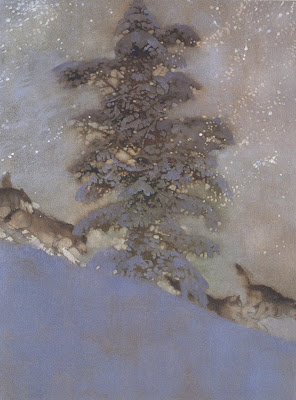
From The Wolves, 1996
###
###
 In one of his most famous sonnets, Shakespeare claims that true love is the permanent thing, the polar star by which we can all guide our ship. Love, he explains, never alters its path no matter what kind of impediment it encounters:
Let me not to the marriage of true minds
Admit impediments. Love is not love
Which alters when it alteration finds,
Or bends with the remover to remove:
O no! it is an ever-fixed mark
That looks on tempests and is never shaken;
It is the star to every wandering bark [ship]....
But here is an opposite view from Yeats. For him, love is crooked and bewildering. And you can forget about that polar star business, love will continue to drive us nuts until those stars have all gone out:O love is the crooked thing,
There is nobody wise enough
To find out all that is in it,
For he would be thinking of love
Till the stars had run away
And the shadows eaten the moon.
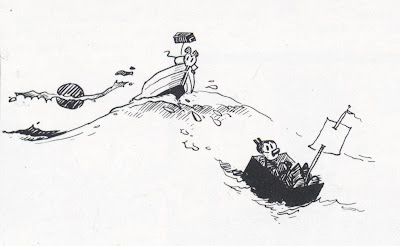
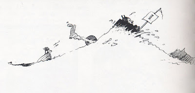
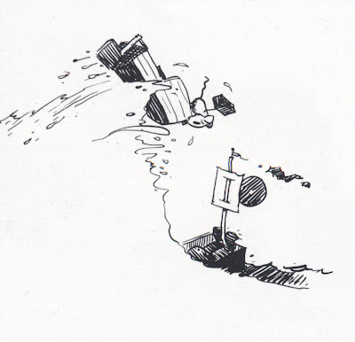
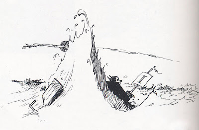
The following episode from the ongoing love/hate saga of Krazy Kat and Ignatz mouse shows Ignatz determined to overcome all obstacles and consummate a brick toss:  Notice how Herriman has provided us with a polar star to make sense of the visual pandemonium. That sun appears to bounce up and down on the horizon, but we soon realize that it is the horizon (along with everything else in the picture) that is bouncing around. The sun is the only thing that remains constant. It is the fixed reference point that gives these drawings the continuity necessary for us to figure out what the heck is going on:


 Herriman doesn't side with either Shakespeare or Yeats. Artists speak in pictures rather than words, so Herriman does not need to worry about reconciling the two conflicting texts. Leave that dirty work to poets and lawyers. Pictures enjoy an ambivalence (and a truth) that words can't match; Herriman depicts an undeterrable Ignatz and a polar star such as Shakespeare might expect, but any love that involves being brained by a brick probably belongs on one of those crooked corners Yeats describes.
Herriman does contribute the insight that sometimes the only resolution of conflicts is found in the limp exhaustion of the couple (whether from happy activity or sad).
 ###
###
 Wrightson