Definition List

A WEEK OF GRUGER, day 3

###
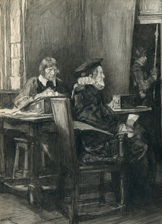
On Tuesday a commenter suggested that Gruger "paints with a pencil." Here is a good example of that effect:

Illustration for the Civil War tale, “The Crystal Chandelier” 
Saturday Evening Post, July 14, 1934, 15.75 x 18"
For me, the exciting part of this picture is not the main figures (who are fairly conventional) but the dirt on the ground.  Gruger positions that dirt at center stage and sculpts it with loving care:


He achieves this effect by starting with a broad foundation of wash made from lamp black.  He then works shapes and structure into that foundation with carbon pencil, blending the carbon into the wash with a stump for tonal effect,  sharpening it with a Wolff pencil point to add accents and vitality, and selectively lifting the smeared carbon with an eraser for highlights.  The result leaves Gruger with the full range of values used by a painter.   

Gruger was a big admirer of Rembrandt and Velasquez and despite his carbon medium, it shows.

The sparkling apex of the triangle, where the most intense darks are contrasted with the brightest whites,  is the woman's dress.  In 1934 readers of the Saturday Evening Post had no way of understanding the starkness of Gruger's contrast.  Thanks to the wonders of Epson, we can now see what Gruger intended.

___________________________
In response to a number of inquiries, the Gruger originals I've been showing over the past few days came from the substantial collection of our friends at the Illustration House gallery
###

A WEEK OF GRUGER, day 2

###
In 1928,  F.R. Gruger was so popular that the Saturday Evening Post published a cartoon by another artist about ways "Gruger could guard his famous technique from the hundreds of ambitious young artists who would possess it." 


But Gruger's "famous technique" wasn't all that secret.  Essentially he used pencil on cardboard.  Sometimes he supplemented it with a little wash.  His only protection against imitators was his talent.

Gruger drew on a cheap board that he discovered when he first started out on the staff of a newspaper art department.  Newspaper printers used thin cardboard, called "railroad blank," as a backing for silverprints.  Gruger found stacks of the stuff lying around, and nobody cared how much he used.  He discovered that the soft surface took his pencil well, and he soon began experimenting with an eraser and smearing carbon for special effects. The board later became famous as "Gruger board," in recognition of the miracles that Gruger was able to perform on it.  But many wonderful Gruger originals are no longer with us today because the treacherous Gruger board was so flimsy.

The artist began an illustration with a light pencil drawing on the cardboard. He would sometimes go over this preliminary drawing with a wash made from black watercolor, to block out his tonal composition.  Then he followed up with pencils, starting with a hard pencil and finishing up with a Wolff carbon pencil which produced a "rich, velvety black" that was so often lost in the reproduction process.

Let's see how this approach worked in some close ups from another Gruger original:

“The King’s Minion” by Rafael Sabatini, American Magazine, September 1930

Note how Gruger draws important faces in relatively sharp focus, but then quickly drops back as he pulls away from those focal points.  He indicates surrounding elements such as hands in softer terms so they don't compete with the faces:


Gruger deliberately went back and smudged this hand with an eraser.

By the time Gruger gets to background figures,  they are mostly just shapes added for compositional purposes.


No fingernails here: these hands are a lovely little abstraction.

But for me, the most impressive thing about the way Gruger prioritized his drawing was his control over the value scale. 


That's why it's such a shame that most people only know Gruger for the etiolated images on the inner pages of old magazines.


Gruger drew on cheap board which is already crumbling around the edges, and his completed work was printed on cheap magazine paper which robbed his drawings of their dark and light accents.  Sandwiched between these two limitations, Gruger nevertheless put his heart and talent into 6,000 carbon illustrations. Before his original marks disappear altogether, they deserve an appropriate audience.  

###

A WEEK OF GRUGER

###

Nobody talks much today about Frederic Rodrigo Gruger (1871-1953), but years ago, Time magazine proclaimed Gruger "the dean of U.S. magazine illustrators." Norman Rockwell looked up to Gruger as "one of our greatest illustrators."

I suspect one reason Gruger is not more highly regarded today is that his illustrations (almost exclusively black and white drawings) were printed using the limited technology of his era, which turned his rich, dense blacks into chalky grays and lost much of the sharpness and sensitivity of his line.

Gruger in The Saturday Evening Post

Despite the constraints of his medium, Gruger continued to create an astonishing 6,000 illustrations from 1898 to 1943 employing consistently high standards.  His work appeared in most of the top publications of his era. Such an artistic effort deserves attention.

Fortunately, today's improved technology creates a perfect opportunity to assess Gruger's work as it really looked.  So each day this week we'll check out scans of some of Gruger's original drawings.

 Illustration from “Show Boat” by Edna Ferber,
Woman’s Home Companion, April 1926,
Carbon pencil & wash, 10.75 x 16.5"


Gruger understood the human form well enough to rotate human heads and hands as needed for his composition.

Gruger proudly displays his swordsmanship, nimbly searching out the designs in his subject.  Leaving these organizing  lines exposed  preserves vitality in a drawing that might otherwise become overworked and sedentary.

As figures become less important, Gruger's pencil lines become lighter and his details become more sparse, yet even with such characters he uses broad strokes accurately to convey body language and make a meaningful contribution to the drawing.

Notice how subtly he uses a wash to consolidate dark areas of interest in his drawing.

Tomorrow, a different type of drawing from Gruger.
###

Custom Dreamcast "SKIES OF ARCADIA" (02)

###
Après la première Dreamcast customisé à l'image de Skies of Arcadia, voici la seconde et ses trois manettes, toujours customisé au posca.


Pad Aika

Pad Vyse

Pad Fina

###

THE SONG OF THE CYNODONT

###
Cynodont

250 million years ago, before death negotiated its current truce with life, death nearly wiped out all life on earth in a fit of exuberance.

During the Permian Extinction, 96% of all marine species and 70% of all land based vertebrates became extinct. 83% of all genera of insects were wiped out. The planet became a global abattoir, reeking with the stench of spattered life forms whose long and miraculous histories had come abruptly to naught.

Through that million year charnel house crawled one ugly, unpromising little beast: the cynodont.

Cynodont reconstruction from  BBC

Dull and witless, the cynodont stubbornly continued to place one foot in front of the other. It had no hopes for the future to motivate it, but still it held on.

The cynodont could not know that its children would one day evolve into the first mammal, and from mammals would arise human beings. By clinging to life through the Permian extinction, the cynodont made human life and all of its glories possible. 


Who was more responsible for the divine moments in art history:  Michelangelo, Rembrandt and Botticelli?  Or the cynodont, who persisted through a million-year midnight?

Like the cynodont, none of us receives a guarantee that our suffering will be rewarded with a meaningful outcome.  Those fortunate enough to be born with the song of the cynodont in their heart persist anyway.  For them, even the remotest possibility of a happy ending is enough of a reason to continue.  Yet there are others-- equally talented,  intelligent, and filled with promise-- who just can't find it within themselves to hang on.  Imagine what their lives might have led to, if they had just continued putting one foot in front of the other. 


For Lauren, 1986- 2012

Persephone,
Take her head upon your knee;
Say to her, "My dear, my dear,
It is not so dreadful here."

         -- Edna St. Vincent Millay

###

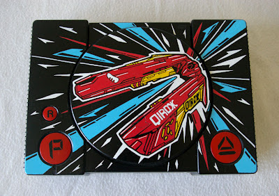
Custom Playstation "WIPEOUT"

###
Playstation customisé au posca.


###

WARRING WITH TROLLS, part one

###

 "To live is to war with trolls"  --Henrik Ibsen

Legendary graphic designer Milton Glaser invented the famous "I Love New York" rebus and donated it to the city he loves.

Glaser's original sketch from the collection of the Museum of Modern Art

The city's Department of Commerce trademarked it and generated substantial income for the city.


Many years later, following the attack on New York's World Trade Center on September 11th, Glaser changed his famous logo:
I woke up one day, a few days after 9/11.  I thought, you know, “I love New York” isn’t the story anymore. Something happened. And I realized that what had happened was an injury, like when a friend of yours, somebody you love, gets terribly sick.... A confident giant is hard to love, but a vulnerable giant is easy to love. All of us became aware that the city was vulnerable. Everybody’s heart was bursting with this feeling, “God, I belong here. It’s my city.” And it came to me as an image, you know, it’s a mark, it’s a black mark on the heart.... And so I said, “Gee, I love New York more than ever as a result of this.”

Logo with scorched heart

Glaser offered his revised version to the NY Department of Commerce but they weren't interested.  In an interview in The Believer, Glaser described what happened next:
So the most difficult thing of course is how to introduce one’s ideas into the bloodstream of the culture. It’s very difficult without money or support or approval, because the nature of institutions is to resist all ideas from the outside... So I got a printer, and he said, “I’ll do it for nothing.” And so we printed 5,000 small posters. And so the kids divided the city into segments, and overnight, these posters appeared in windows all over town. And then I called Pete Hammill over at the Daily News, an old friend of mine. And I said, “Pete, I have something, and I wonder if you could find some use for it, or run it in the paper...." He said, “Great, send it down,” so I sent it down, and they called me back and said, “We’ll find a way to use it.” And a day later, they used it as a wraparound for that day’s edition of the paper—the whole thing—and there were a million copies of it out there.
After his revised logo was embraced by the country, Glaser received a call from the NY Department of Commerce, which had changed its mind and now wanted to use it.  However, they decided to improve Glaser's design by removing the black mark on the heart.  Glaser responded, “Sorry, you can’t do it without the black mark on the heart, because that’s the whole point of it.”

In the time-honored tradition of tasteless bureaucrats everywhere, the city employee reacted by threatening Glaser: “You know, you’re in violation of our trademark. So don’t try to use it in any way.”  Soon Glaser received a nasty letter from a lawyer for the city demanding all of Glaser's records of how much money he'd made from the logo, threatening to subpoena him and take him to court.
I couldn’t believe it. So I sent a letter to [the Governor] because of course I hadn’t made any money. Every penny that was made on it went to either the firemen’s fund, or to restore the antenna on WNYC or something. So it was clear: There was no documentation, no paper trail, the whole point of it was not to benefit from it. I also didn’t license it to anybody, because I didn’t want anybody else to make money off it, which would be totally inappropriate.   And a few days later, [the city called back] “We shouldn’t have threatened you. And it was an error. Could we just forget about it?” So I said, “Sure, why don’t we just forget about it.”
There are numerous obstacles to successful creative activity-- a paucity of talent or energy or funds, a paucity of opportunities or time or connections-- but perhaps the most aggravating and interesting obstacle is when morons dig in their heels to oppose it.  Of all the hindrances on the artist's gauntlet, this one is the most unnecessary, yet nature has seen fit to place great energy and enthusiasm behind it.

There are many colorful stories out there about warring with trolls.  This has been one of them.
###

Black STORMTROOPER + Clip

###
Posca sur toile (80x100cm). Clip réalisé par mon frère, court mais efficace! Cliquez sur l'image pour voir la vidéo.


###

Toiles en vrac

###
Quelques toiles réalisé au posca.


###

Petite vidéo de présentation

###
Une vidéo de présentation réalisé par l'équipe du site "le collectif orange". Merci à toute l'équipe! Cliquez sur l'image pour voir la vidéo.

###
 

Privacy Policy

Popular Posts

Blog Archive