Definition List

REPORT FROM COMICON, part 2

###
Every artistic choice represents a struggle over the significance of information:
  • How much information needs to be included in the picture and what should be left out ? 
  • How large should an element be in relation to other elements?  
  • What colors give it the proper emphasis?
  • How much detail should it have, before detail starts to become counterproductive?

These choices about information establish the artist's priorities; they are at the heart of what makes art great and important.  They affect not just the content but the timing of art's revelations-- the strategic places where art pauses as it lifts its petticoats.

But in our era of information technology, "information" has been radically redefined, and consequently so has the artist's struggle to manage information with taste and style.

The ability to evaluate -- "assign value to"-- information may be the central identity crisis for art in our time.  Technology enables us to automate information management with search engines, data mining and similar tools.  (For example, it would be impossible for you to make sense of those 120 cable TV channels without the software to scan and make those channels comprehensible.)  But so far such tools provide little assistance for the kind of meaningful evaluation traditionally performed by artists. 

Andy Warhol recognized very early that the mind of the artist would be outmatched by our new ability to gather information.  He abdicated the artist's editorial role in films such as Sleep which simply recorded a man sleeping for 40 minutes.  By turning the camera on and collecting information unfiltered by human taste, Warhol showed the muscularity of technology when it comes to capturing raw data.  But in the long term that revelation does not help us isolate the elements that are worth saving and thinking about.

Since Warhol's day, the ratio of information to idea has become increasingly anemic.  Live video captures and video installations drone on indiscriminately in the world of fine art.  Digital installations create immersive environments and even virtual realms but they are adrift.  In the words of Karrie Jacobs, "With information technology our reach is infinite but our grasp is weak."

Which brings me to ComicCon, the real subject of today's post.

Each year when I return to ComicCon, I am impressed with the progress that picture making and story telling have made in moving into the digital space.  I attend a dozen programs with titles such as "Reinventing the Graphic Novel for the Ipad" or "New Methods in Digital Painting" or "The Future of Graphic Novels." At these programs, talented and energetic entrepreneurs out to make a buck describe their latest innovations in curating the vast sea of information.  They talk about "the heritage of story telling colliding with the digital space," and look for solutions that "celebrate the valuable and the good in digital" while avoiding the vast quantities of "disposable junk" which has no human or commercial value.

Sometimes the images from these projects are weak, often photoshopped from photographs, but these creators have at least made a good start; they have learned to employ apps to make a monster in the background of one panel get up and crawl out of the panel and across the page of your e-book.  They have wrestled earnestly to find the best way to support a drawing with a historical film clip, and unlike Andy Warhol, they fight to remain in artistic control of the technology: "Even though it would be easy to incorporate a whole Wikipedia article at this point, we want just the right amount of content, and in the right form, to make the reader curious" and enhance the story.

Good ol' commercial art.

When "gallery" art becomes overwhelmed and superfluous and decadent, art in the service of robust commerce retains its center of gravity.  It has an economic incentive (which "art for art's sake" lacks) to put up a good fight to keep information relevant and comprehensible.

For me, art has greater value when it is integrated into life, in the service of the story or the hunt or the sacred, or even just decorating our environment with folk art the same way the bower bird decorates its nest.  Commercial art tortures artists with the need for prioritization,  but there seems to be no better antidote to the self-indulgence and pretentiousness that have robbed gallery art of the critical faculties necessary to make important judgments about digital information.

Obligatory Picture

Since this blog is all about pictures, any of you who have plowed through all this verbage deserve at least one picture.  Here is what appears to be an insightful bit of social commentary from your old friends at Playboy Magazine:  as I left my hotel one morning, I discovered  that Playboy had sent "bunny Avengers" to ComicCon. They were assembling in the hotel lobby; if you look closely, you'll see "bunny Hulk," "bunny Thor," "bunny Captain America," etc.


 What could possibly be cooler than that?
###

Custom Game Boy "WARIO LAND"

###
Game Boy customisé au posca.


###

REPORT FROM COMICCON, part 1

###
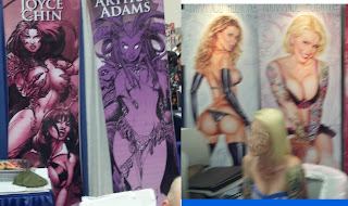
Once again, this year's ComicCon brought together the world's most diverse array of pictures of large breasted barbarian women wearing skimpy chain mail halter tops and brandishing broad swords. 

A sampling of the large banners behind the tables in ComicCon's exhibition hall

Because artists at ComicCon come from all over the world, attendees can view a cross section of approaches and philosophies: sometimes the warrior holds the sword in her left hand, sometimes she holds it in her right hand.  One groundbreaking artist was rumored to have depicted a woman holding the sword with both hands.

The long rows of banners created an army to rival the army of emperor Qin Shi Huang. 

The similarity of these images occasionally made it difficult to navigate the hall.  If you were instructed to "turn left at the eight foot banner of the half naked warrior girl," you might quickly find yourself in an endless loop. 

Many of the artists responsible for these images showed considerable technical skill, although it is difficult to predict how they might fare with more diverse subject matter-- for example, a guy.

I'm sure this subject was a sensible choice for marketing purposes, and I give wide latitude to any artist trying to earn an honest living.  However, after fifty years there are only so many refinements that can be made to the prototypes established by Frank Frazetta and a handful of other true creators.  Time for some new prototypes.
###

THE LENGTH OF YOUR LEASH

###
James Williamson for the Saturday Evening Post (1949)

There is a gap, at least 12 tugboats wide, between what an artist can imagine and what that artist can actually put on paper.

It does no good for working artists to imagine a picture they lack the technical skill to implement. Famed illustrator Seymour Chwast confessed that he avoids pictures “that require craftsmanship and a drawing ability I do not have.” Elwood Smith maintains that his inability to draw the images he envisions forces him to be more creative: “if I can’t draw it, I struggle to come up with a different idea that’s invariably more original."

Lots of artists today seem limited by their skills to a depressingly short menu of alternatives.  Many pictures are reduced to elementary line drawings with basic compositions (or even worse-- Photoshopped montages).  In graphic novels or syndicated comic strips-- art forms that once attracted skillful draftsmen--  a simplistic approach has become common.
   
We live in a culture that is forgiving of poor execution skills, and sometimes that's a good thing.  I love many pictures that have a raw, unfinished look, pictures where accident plays an important role, or pictures where simplicity and economy leave more room for the concept.

Nevertheless, there's an undeniable attraction to pictures where an artist has the skill to be fearless.  Artists who can can confidently rotate angles or force perspective to overcome the constraints of tiny spaces, artists who can manage large amounts of information in a picture without overcrowding it --such artists don't need to keep their imaginations on a short leash.

James Williamson constructed the above illustration like a master carpenter.  To convey newlyweds separated by a domineering mother-in-law, he cleverly staged a three tiered opera: 

The sobbing, ambivalent bride sequestered by her mother (and visually, by her illustrator)

All shapes and colors lead to the dominant mother in law, who bifurcates the couple and the picture.  Her hand gesture and open mouth are framed in stark relief for emphasis.

The diminished figure of the husband at the bottom of the totem pole by the ironic "welcome" mat

Williamson uses the architecture of the house as architecture for his drawing.  It simultaneously gives him an abstract design and makes a complex drawing intelligible.  The viewer could easily become confused by a less skillful artist, but we read this in exactly the sequence Williamson intended.

One current artist who seems free to go wherever the job and his imagination take him is the always entertaining Denis Zilber. You never get the feeling Zilber has to hold back because he doesn't know how to draw.

 Zilber bends perspective and anatomy to simultaneously show us the expression on the face of this lecherous old goat, his pot belly, and the object of his attention.  Quite a tour de force.

Here Zilber makes shadows do his bidding, superimposed on extreme (but convincing) angle shots and foreshortening.

Plenty of artists do overhead shots, but how many do them in the rain?


An image I've shown before, but one which helps to make this point.

There's no guarantee that skills will result in a great picture; it does no good to draw what you imagine if you lack imagination.  But I am constantly reminded by work such as Williamson's or Zilber's that it sure helps to start from a position of strength,
###
 

Privacy Policy

Popular Posts

Blog Archive