Definition List

ILLUSTRATION vs. FINE ART, round two

###
The great French impressionist Monet was famous for painting the same subject (such as hay stacks) in different light at different times of the day. By capturing his subject at morning, noon and night, he demonstrated how light and atmosphere transform an object.


 In 1952, Norman Rockwell did the exact same thing with his cover painting for the Saturday Evening Post, "A Day In The Life Of A Girl."


In a single painting, Rockwell divides the day into 22 separate vignettes, from dawn until nightfall. Each vignette is a brilliant study of the light at that particular time of the day. In the morning sun, in the reflected light of a swimming pool, in the neon light outside a theatre, in the warm glow of a bedside lamp or illuminated by moonlight, Rockwell's girl undergoes color changes that, while not as flashy and lurid as Monet's haystacks, are just as sensitive to the nuances of light at any given time of the day.

A less observant artist might use the same skin tones and hair color throughout the painting, if only for continuity in a complex composition. Not Rockwell. His power of observation was exceeded only by his work ethic.

The only way to appreciate Rockwell's accomplishment is to view the original painting at the Rockwell Museum in Stockbridge, Mass. Unfortunately, I have only a scan of a dull print to reproduce here. Perhaps it will give you enough of a taste so that you will find it worth your while to check out the original. If you like Monet, it will be well worth your time.


The opening vignette is gilded with a brilliant yellow white color (that unfortunately does not show up well on the printed cover).


Below, Rockwell depicts the children in the glow from the light of a theatre marquee:

Next he shows the children illuminated by the light of the silver screen:


The children's skin takes on a completely different color at dusk, just like Monet's haystacks.

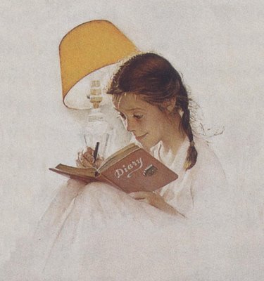
Contrast the cool light of the moon above with the warm glow of the bedside lamp as the girl fills out her diary:
 

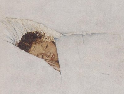
Back in bed: compare the colors at night with the colors of the girl waking up:

Comparing Rockwell and Monet solely for their studies of light (without all the distracting smoke and mirrors from overfed publicity agents and Manhattan auction houses) I think Rockwell's painting accomplishes more than Monet's. Rockwell portrays more variations in natural and artificial light, working in a smaller, humbler space, with more sensitivity and technical skill than Monet. Rockwell's handicap was of course the sappy story line, which was designed to please the 1950s readers of the Saturday Evening Post. But if you put aside the content and pay attention to the things that matter to an artist, you will see that Rockwell's artistic challenge was the same as Monet's. The real subject of Rockwell's painting, like Monet's haystacks, is the effect of changing light. If you're looking for a safe commodity to invest in, pick the Monet. If you're ready to learn something about light, pick the Rockwell.
###

FINE ART vs. ART THAT'S MIGHTY FINE

###
In the 1950s and '60s, fine artists Robert Motherwell, Robert Rauschenberg and Franz Kline dazzled art critics and museums around the world with their brilliant avant garde paintings.

At the same time, another painter-- Bernie Fuchs-- dealt with the exact same aesthetic problems in a different forum. Like Motherwell, Rauschenberg and Kline, Fuchs rejected the realistic painting of his predecessors (such as Norman Rockwell) and focused on broader qualities of abstract design and composition.

If we compare Fuchs' art with the work of the other three painters, applying the same standards, it is difficult to tell which painter is superior. Fuchs' compositions were equally bold and lovely. The colors and shapes were comparable. In fact, the only consistent difference between Fuchs and the three "fine" artists was the purpose for which the art was created. Motherwell, Rauschenberg and Kline created art for art's sake. Fuchs' art had a commercial function. He created art for a client's sake, for he is an illustrator.

Fuchs and Franz Kline:


These two paintings by Fuchs (above) and Kline (below)share vigorous, caligraphic brush strokes, strong compositions against a painterly white background, and stark use of negative space. Both were highly innovative for their day. Can you tell which one belongs in a museum?

Fuchs and Robert Motherwell:

Measured as abstract art, the following Fuchs painting...


... accomplishes everything the Motherwell painting below it does.


The big difference: the Fuchs painting also serves a function.

Fuchs and Robert Rauschenberg:

Beginning in the early 1960s, Fuchs began assembling "montage" pictures with multiple images, sometimes including photographs or "found" objects. In doing so, he rejected the orthodox notion that an illustration had to be a single image.


At exactly the same time, Rauschenberg wowed the art critics with his groundbreaking approach using montage images such as the one below.


The Fuchs painting appeared on the cover of TV Guide. The Rauschenberg piece appeared in a museum. While Rauschenberg lacked some fundamental drawing skills, I think he was nevertheless able to make a very nice montage out of photographic images.

Society For The Prevention of Cruelty To Dead Horses:

At the risk of belaboring the obvious, if the "fine art" market had a higher ratio of intellectual integrity to bloviation and avarice, museums would display fewer pictures on the basis of pedigree and more pictures on the basis of the object itself.


###
 

Privacy Policy

Popular Posts

Blog Archive