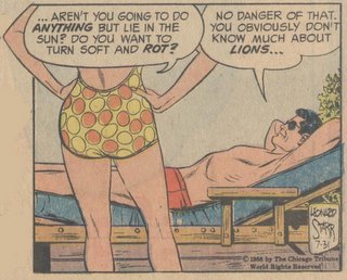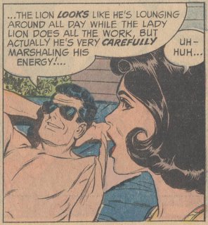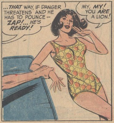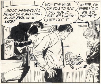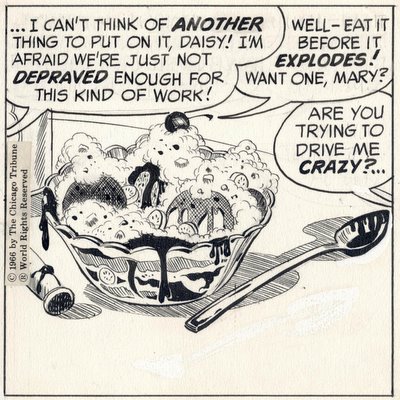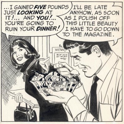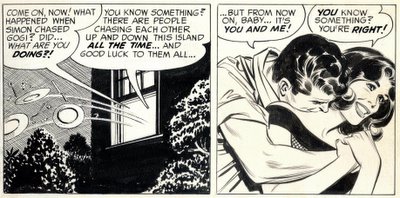
Fans of Chris Ware, Art Spiegelman and other popular graphic novelists patiently explained to me last week that I am wrong to expect "slick, commercial" design in art that deals with higher truths about alienation and the tortured soul of the artist. Technical skill may be important for commercial art used to sell Coca-Cola, but is less relevant to today's more honest and personal artwork, with its tragic or subversive messages.
I admit it's difficult to criticize Maus or Fun Home merely because the authors do not draw well. But personally, I don't think the epithet "commercial" is a useful tool when seeking out quality art. Many bad pictures of sincere, personal subjects can be found hanging in art museums. Many brilliant pictures of dishwashing detergent can be found in magazine ads. As far as I know, nobody has yet established a connection between purity of motive and quality of picture.
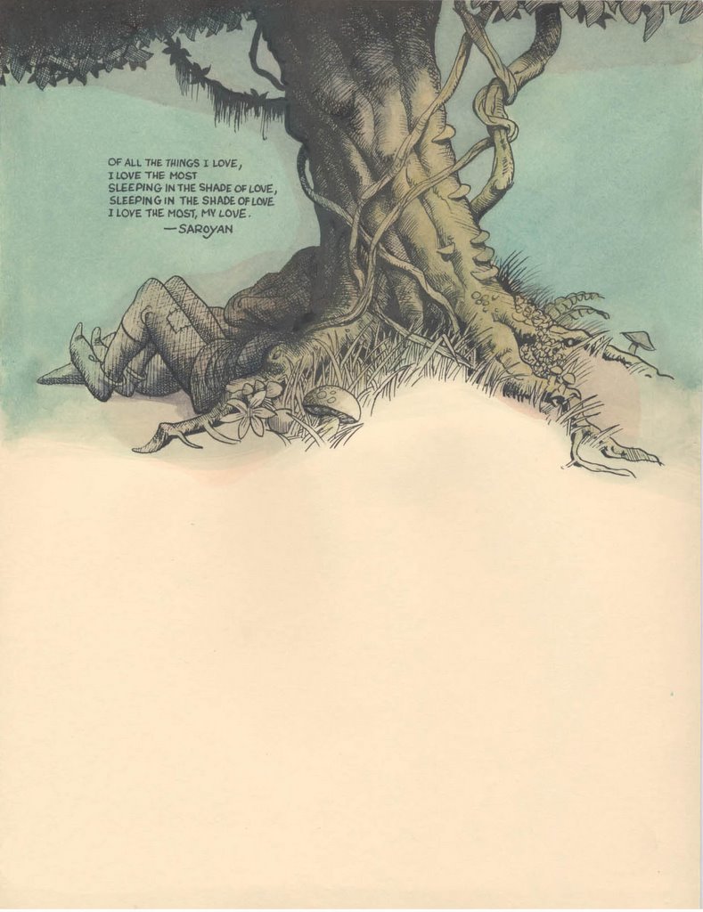
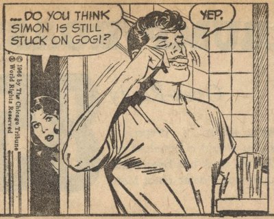
It may be sad that, as Thoreau remarked, "most men lead lives of quiet desperation," but after reading Chris Ware, we might wish that desperate men would be a little quieter.
If artistic purity is what matters to you, I'm not sure you'll find much difference between commercial illustration, graphic novels and the pictures hanging in the Museum of Modern Art. They are all commercial. (Andy Warhol famously remarked that "good business is the best art.") Instead, try setting your sights a little higher and check out the true "outsider" artists. If the stink of commercialism offends you, you have to be prepared to hang around artists who don't use soap regularly.
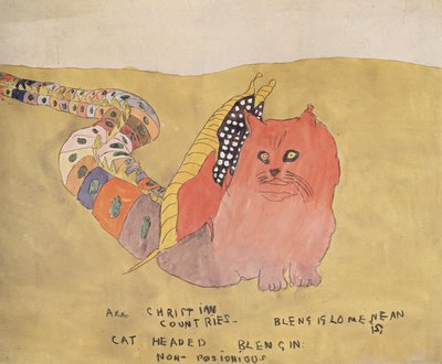
Henry Darger
Often untrained, working in obscurity and poverty, ignored by the New York glitterati, "outsider" artists work only to serve their god or their muse, or sometimes their alien leaders on the planet Zarbtron.
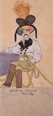
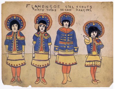
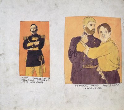
For example, the artist Henry Darger was an impoverished janitor and dishwasher who lived for 50 years in a shabby apartment so tiny he had to sleep sitting up. He worked late into the night illustrating his magnificent graphic novel, In the Realms of the Unreal.

Henry Darger
Darger led a life of isolation and pain that makes Jimmy Corrigan's life look like a day at Disneyworld. Yet, Darger's artwork is filled with dazzling images. He did not use his suffering as a justification for ignoring composition, design, color or the other standards inherent in his chosen medium. His beautiful pictures were able to advance, rather than work in opposition to, his troubling personal message.
It is also worth noting that Darger never dwelled on his own suffering and insecurities. Instead, he elevated his personal misery to epic tragedy with his art. You will find no self-obssessed whimpering in Darger's work.
Henry Darger
Darger kept these exquisite illustrations to himself until the day he died. He was not working to impress the critics or harvest royalties. He used art to struggle with his own personal demons.
Henry Darger
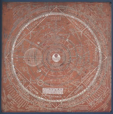
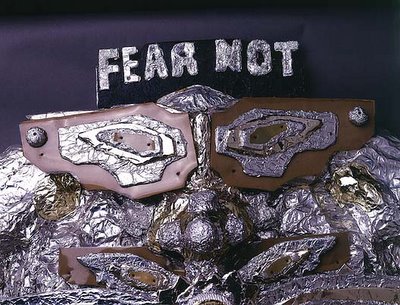
Another "outsider" artist, James Hampton, was a janitor who lived a lonely life of poverty. Beginning in the late 1940s, Hampton began writing about his religious visions using pictograms and secret codes.

He drew marvelous symbols such as lightning bolts and omniscient eyes. Hampton spent the last fifteen years of his life integrating these symbols and pictograms into astonishing sculptures comprised of aluminum foil, light bulbs and pieces of old furniture.

He called his strange and beautiful masterpiece, "The Throne of the Third Heaven of the Nations' Millennium General Assembly."
James Hampton
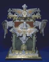
Like Darger, Hampton was not out to impress Art News. He did not whine or complain about the unfairness of life. Hampton's own landlord had no idea what Hampton was up to. After Hampton died, his landlord was shocked to discover Hampton's masterpiece in the unheated garage where Hampton had labored all those years.

James Hampton
The Throne of the Third Heaven is made up of 177 separate art objects, combining words, symbols, drawings and sculpture. Standing before it, the cumulative effect is enough to inspire dread for your immortal soul.

Although they never received recognition during their lives, the work of Darger and Hampton is superior to anything I have seen from Spiegelman or Ware. Darger and Hampton worked with greater handicaps, under more difficult circumstances, and yet made better art.
There is also an important philosophical difference here, which should probably be irrelevant to a blog about illustration, but which I confess colors my judgment. It seems to me that the artistic response of these outsider artists to personal pain and the weight of their humanity was a more noble, less self-indulgent response. The guys who seem to know the most about this tragedy business-- Shakespeare, Aeschylus, Sophocles, Euripedes-- remind us that suffering and doom are an inescapable part of the human condition, and that our only meager defense is the tragic hero's capacity to elevate mere misery into the majesty of tragedy. This is done through courage, perseverance and understanding in the face of hopelessness. (Not much of a consolation prize, I admit, but hey, what other options are you offering?) My purely subjective judgment is that Jimmy Corrigan dwells at the misery level, and I find no nutritional content from visiting him a second or third time.

One of my readers, in explaining where I've gone wrong, compared Chris Ware to Shakespeare. In my view, for all his sincerity, Chris Ware's work is artistically feeble compared to Darger's.
There are of course thousands of other "outsider" artists, some making beautiful art, some making terrible art. But if you genuinely reject "commercialism" in art and strive for artistic purity, put down your graphic novels and invest a little time with real outsiders.
Henry Darger
Darger kept these exquisite illustrations to himself until the day he died. He was not working to impress the critics or harvest royalties. He used art to struggle with his own personal demons.
Henry Darger
Another "outsider" artist, James Hampton, was a janitor who lived a lonely life of poverty. Beginning in the late 1940s, Hampton began writing about his religious visions using pictograms and secret codes.

He drew marvelous symbols such as lightning bolts and omniscient eyes. Hampton spent the last fifteen years of his life integrating these symbols and pictograms into astonishing sculptures comprised of aluminum foil, light bulbs and pieces of old furniture.

He called his strange and beautiful masterpiece, "The Throne of the Third Heaven of the Nations' Millennium General Assembly."

James Hampton
Like Darger, Hampton was not out to impress Art News. He did not whine or complain about the unfairness of life. Hampton's own landlord had no idea what Hampton was up to. After Hampton died, his landlord was shocked to discover Hampton's masterpiece in the unheated garage where Hampton had labored all those years.
James Hampton
The Throne of the Third Heaven is made up of 177 separate art objects, combining words, symbols, drawings and sculpture. Standing before it, the cumulative effect is enough to inspire dread for your immortal soul.

Although they never received recognition during their lives, the work of Darger and Hampton is superior to anything I have seen from Spiegelman or Ware. Darger and Hampton worked with greater handicaps, under more difficult circumstances, and yet made better art.
There is also an important philosophical difference here, which should probably be irrelevant to a blog about illustration, but which I confess colors my judgment. It seems to me that the artistic response of these outsider artists to personal pain and the weight of their humanity was a more noble, less self-indulgent response. The guys who seem to know the most about this tragedy business-- Shakespeare, Aeschylus, Sophocles, Euripedes-- remind us that suffering and doom are an inescapable part of the human condition, and that our only meager defense is the tragic hero's capacity to elevate mere misery into the majesty of tragedy. This is done through courage, perseverance and understanding in the face of hopelessness. (Not much of a consolation prize, I admit, but hey, what other options are you offering?) My purely subjective judgment is that Jimmy Corrigan dwells at the misery level, and I find no nutritional content from visiting him a second or third time.
One of my readers, in explaining where I've gone wrong, compared Chris Ware to Shakespeare. In my view, for all his sincerity, Chris Ware's work is artistically feeble compared to Darger's.
There are of course thousands of other "outsider" artists, some making beautiful art, some making terrible art. But if you genuinely reject "commercialism" in art and strive for artistic purity, put down your graphic novels and invest a little time with real outsiders.