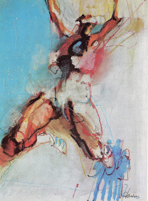
"Wildness can be the picture's better part, its physical delight." -- Gordon ParksIn the 1960s, American illustration entered a wild, expressive phase. Many illustrators employed vigorous, slashing strokes to convey the new mood (and speed) of the country.
 |
| Bob Peak |
These pictures had an energy and virility that still stands out, fifty years later. Bob Peak was one prominent example of that style, but there were dozens of less well known illustrators who helped to visualize the mood of the '60s.
For example, the talented Harvey Schmidt worked in a similarly robust, vigorous style:
Another talented illustrator, Jim Jonson, made expressive, high velocity illustrations of figures stretched to the max:
Here, Neil Boyle applies this same energetic line to inanimate objects:
The Society of Illustrators annuals from the '60s contain a great deal of art in this dynamic spirit; lots of slashing lines and lightning bolt scribbles back and forth. In later decades illustration might adopt a more conceptual approach. Later audiences might grow to prefer a more controlled look. Yet, these pictures from the '60s retain a potency that is undeniable.
One reason these pictures feel good to look at is because they felt good to make. They exemplify what Parks called the "physical delight" of picture making-- something that seems less evident in the era of Wacom tablets.
 |
| Robert Weaver |
 |
| Al Parker |
 |
| Joe Cleary |


